UX Portfolio
Challenge
Employers are overworking employees and aren’t realizing it. Employee burnout rates are at an all time high. Employers are mistaking hard work with overworked employees. Which is leading to less productivity, higher turnover rates, and a huge rise in medical cases.
Approach
Secondary Research
Primary Research
Affinity Mapping
User Experience Mapping
Sketching
Wireframing
UI Research and Inspiration
User Testing
Brand Development
High Fidelity Injection and Testing
Results
Feeling safe at work and the grey area of communication between employers and employees about mental health seemed to be the root of this challenge. A common theme of job security, the normalization of overbearing workloads, the lack of knowledge of mental health days. These concerns leave employees feeling unsafe.
Research
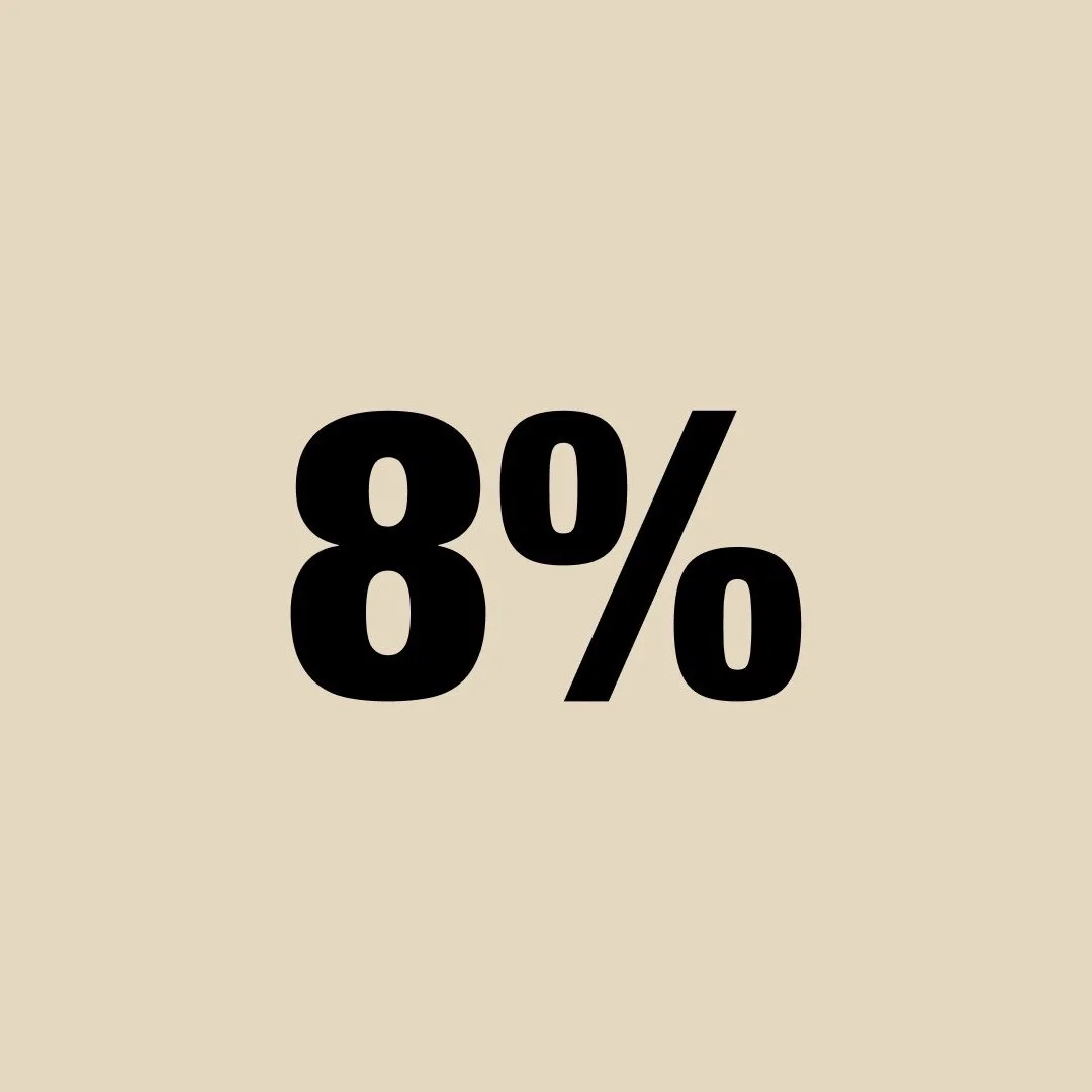
The average turnover rate in the United States in 2020
Of employees said their organization aren’t doing anything to help with burnout.
Of the national budget in healthcare was due to work place stress.
Hypothesis
I believe that employees aren’t sure how to approach their employers about work loads they’ve been tasked with and that culture has nomarlized it. I will know that I am right if 75% of my interviewees have felt uncomfortable bringing up conflict to their employer or have mistaken hard work with the fear of not completing the tasks given to them.
Assumptions
01
Employees don’t know how to approach the situation of burnout with their employers.
02
Burnout is not accepted work cultures. It is seen as an excuse for the lack of productivity one is producing.
03
Many employees are looking for new jobs as an escape from the burnout they are currently facing at work.
Interview Process
For our Primary research we held a decontextualized method. I interviewed five different people that met our the following criteria.
Must be 18+
Currently holding an occupation
Reports to a boss or has employees reporting to them.
Has Co-Workers
Working 40 hours or considered a full time occupation.
““I haven’t heard what a mental health days are in the work places I’ve been apart of.””
-
Beginning the interview process I developed a script that focused on mental health and how the interviewee determines what burnout looks like. Here you can find the notes and the script that was used for the interview process.
-
Next in our interview process I put all the results from the interviews onto sticky notes and began breaking them up into pain points, motivations, and behaviors. To stay organized I separated each section by color then began looking for common themes. In other terms I went with an affinity map process.
As I began breaking them up into themes I began narrowing down my scope on where I believe the problem was for this challenge.
-
Now that I started to break them into themes it was important to decide where the problem was that my interviewees were facing the most. This process I began to narrow down my themes. It was important to not just select the theme that has the most pain points but, also making sure that it fits in the problem space of employees facing burnout.
As I narrowed down my insights I landed on Safety.
Feeling safe at work allows employees and employers to communicate with out fear. It allows vulnerability within a team and builds trust to share about how they are feeling.
How might we help employees experiencing burnout set and hold
healthy boundaries to protect them from burnout
and avoid job dissatisfaction with continual turnover?
Persona
When developing our persona I kept in mind the results from the interviewees and the themes that were created. Highlighting the pain points from the key insight about safety in developing William.
Pains like:
Having too many projects on his plate and can’t keep up with what the company is asking from him.
Has a hard time finding time to unwind at home and has become short tempered.
Feels like there isn’t a safe place to bring up how his mental health is due to the work culture normalizing high work loads.
Experience Map
In the experience map, we map out our user’s flow touch points with their employer and see where the gap or area of improvement can be found.
User Stories
Developing User Stories
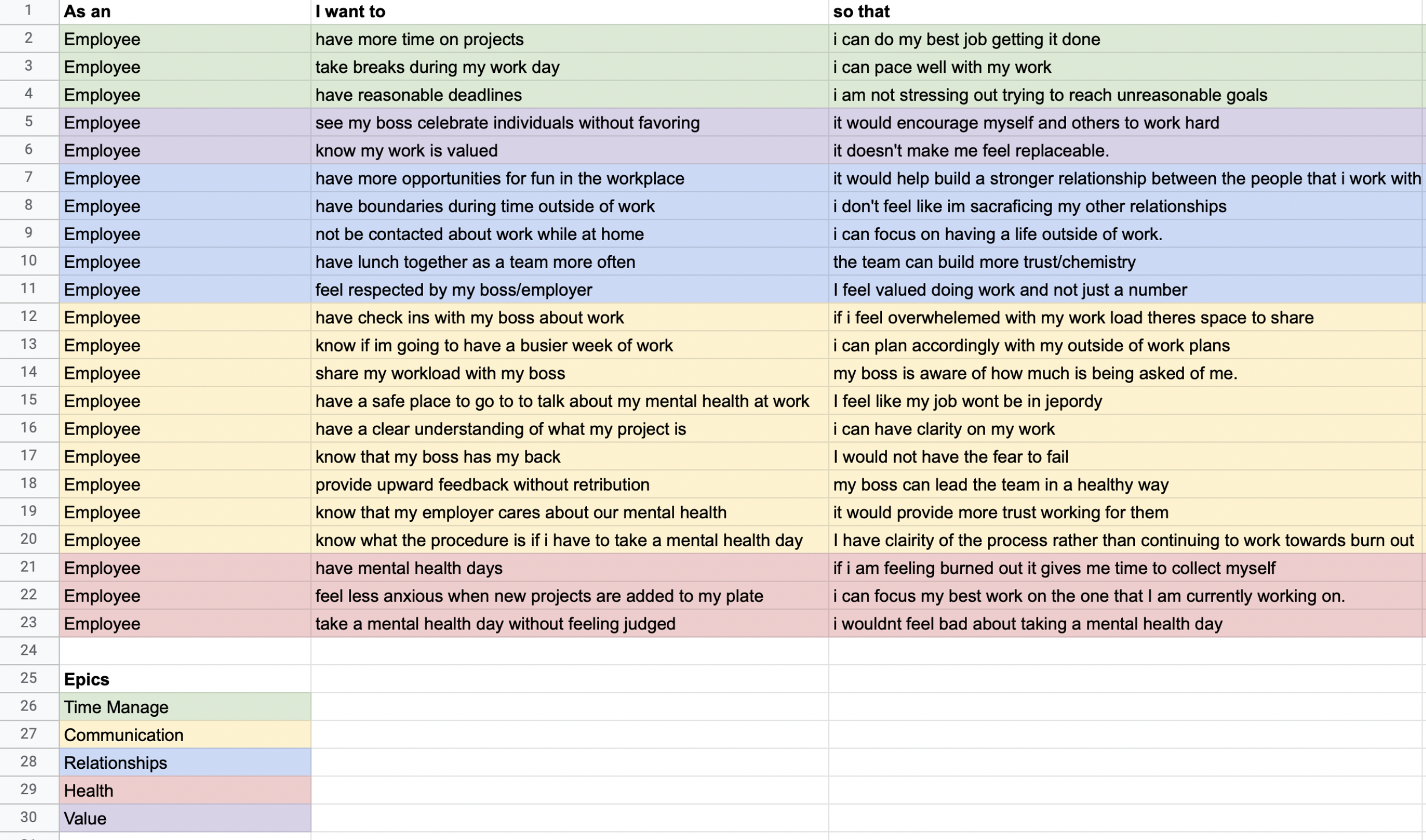
Developing our user stories were based on what would our user like to see. The layout for our User Stories were
As an Employee
I want to __________
so that _________.
Going through this method of creating our user story it allowed me to find what key action we wanted to see our user to do that would relieve them from the following problems they face. All of these are tying into the motivations and pain points of our persona, William.
Ex. As an Employee I want to feel safe sharing the workload I have with my boss so that my boss is aware of how much work is being asked from me.
Breaking into Epics
As I began writing these user stories I broke them up into themes, also known as epics. Just like what we did with the affinity mapping, I began narrowing down my scope. We broke them down into five epics
Time Management
Communication
Relationships
Health
Value
After breaking them into epics, I decided to choose the one that hit the pain points and goals of my persona and connected with the key insight I got from the interview process.
Communication
When picking communication as our key epic to focus on we noticed that there was a gap between employees and employers communication with one another. Whether it was creating realistic expectations on projects or employees having the freedom to share their mental status with their employer without judgement.
Task Flow
User Task Flow Sections
How are you feeling?
Dashboard Overview
Calendar Request Process.
The task flow we put together is a simple booking of a calendar request. But what makes this task flow geared towards more of what the relationship between the employee and employer relationship is that I created more touch points for the employer to check in with their employee. The employer and employer only would be allowed to see how each employee is feeling before diving into work. By creating more touch points for the employer to see the status of their workers it allows mental health to not fall in the cracks of normalized high workloads and productivity.
UI Inspirations
When creating my UI Inspiration board for the app I decided on these four elements. I believe if the employer has more awareness of their employees mental health status it would help close the communication gap between employee and employer. By creating more touch points it holds both sides accountable.
You can view the full UI Board here.
Elements of UI Inspirations
Chat Feature:
I wanted to go with a chat feature because when thinking about a form of communication between an employee and employer having a chat feature is the most direct way to communicate over a device.
Mood Status:
A mood status is another way an employer and employer alone can use as a touch point for their employees. If an employee marks that they are having a bad day for their mood status it allows the employer to see that their employee isn’t having a good day. Which hopefully leads to the employer to do a check-in.
Progress Bar:
As an employer I would want to see how my teams are doing or to see the progression on projects that are given. This turns into another touch point for the employer to check in with their team. This can help employees and employers have more areas to keep in contact.
Task Lists:
Having task lists allows the employee to hold themselves accountable for the work that is given. It allows the employee to set goals and deadlines for projects. Task lists also allows the employer to have a touch point on setting realistic expectations of work loads and allows for another way for the employer to connect with the employee.
Sketching Process
Approach
After finding out what the four UI elements I wanted to sketch, I made a Crazy 8* board and began coming up with different ways I wanted each element to look. Upon sketching I made three to five different screen sketches on the same element. After sketching I began to highlight the areas I liked from each screen. Once I’ve found the highlighted areas I created one screen with that element. I continued to do that for each of the four UI inspirations along with a Home Screen, and confirmation screen.
Crazy 8 Sketching* Is a fast sketching exercise that challenges people to sketch eight distinct ideas in eight minutes. The goal is to push beyond your first idea, frequently the least innovative , and to generate a wide variety of solutions to your challenge.
3-5 different screens of the same features
Highlighting the areas I like the most.
Bringing all of what I like into one screen.
The way I decided on my highlights were based off of what I thought the user would be more familiar with, and that would make the most sense when approaching the challenges or task within the task flow.


Wireframe Construction
Sketches into Mid-fi Wireframes
After finishing the sketching process and landing on how I want the screens to look I began the wireframe building in Figma. Here I began to lay out the screens in order of the task flow. Creating multiple screens for any transitions or animation effects. During this process it was important that my wireframes connects with the task flows. When sketching these screens and putting it together it formed the app. This app is a team management app that focuses on mental health.
Screens that was developed. v1
Dashboard Screen
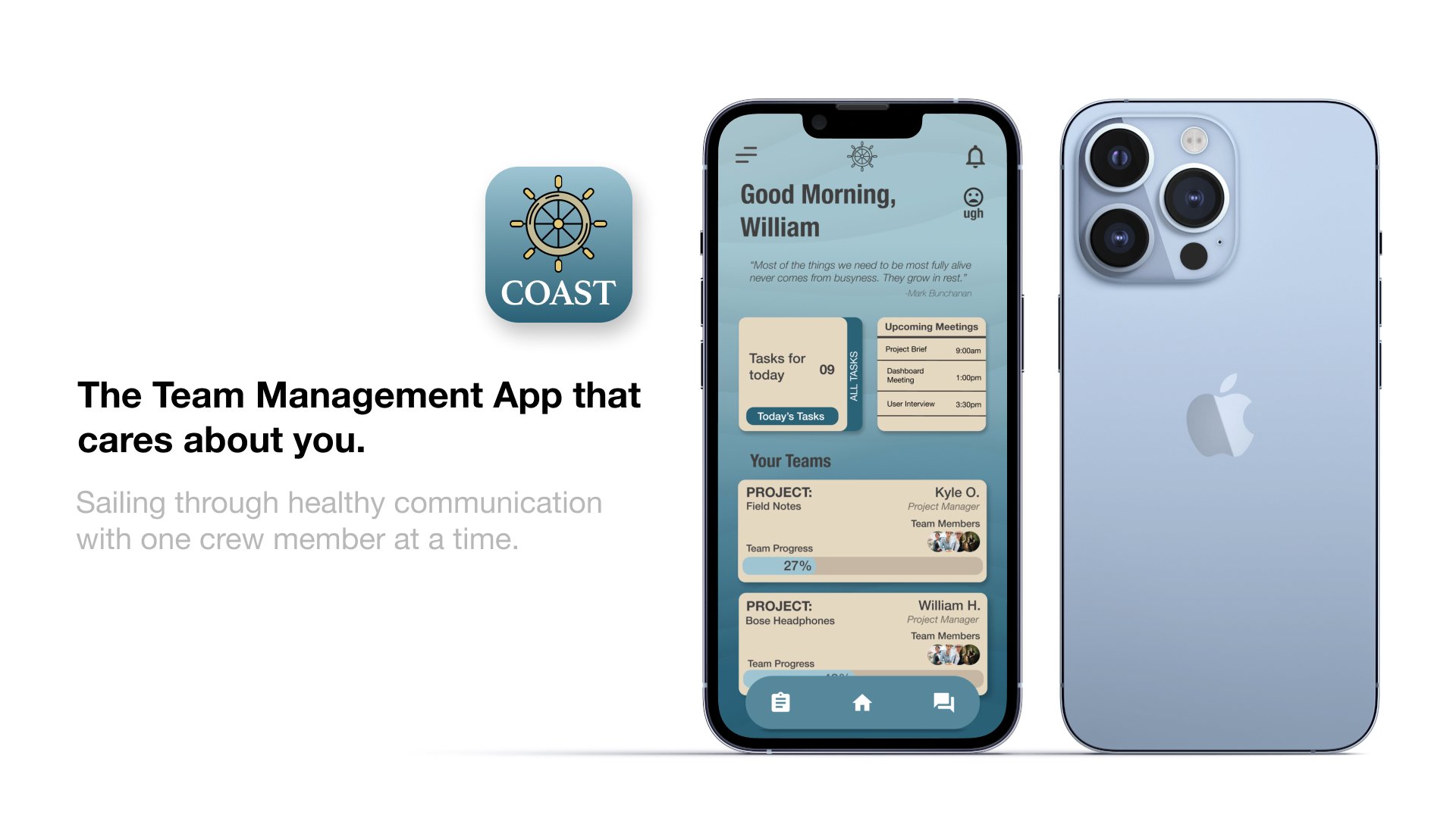
The dashboard screen was the first screen. In this screen it acts as the main home page for the employee. Here the employee can find out what tasks he/she has for the day, see any upcoming meetings, and a projects team card.
Project Team Screen
In the project team screen the employee can view the overall status of the team project and view their current progression. This part of the card also allows you to view your teammates overall status of their task list for that project. This screen is one main touchpoint for both the employee and employer to view productivity status. But also allows the employer to connect with the employee about their mental health. The example in this screen shows that our user, Will, is behind on a few projects and is greeted with a message from his project manager Kyle. Kyle’s message is an example of what it could look like for an employer to engage their employee on a mental health check in.
Direct Message- Kyle Screen
The direct message from Kyle becomes tappable for the employee to go straight to message area. This was important to make something that the user would feel familiar with using. From there the employee is greeted with another message from Kyle asking the employee to make a calendar request with him and that is doable by tapping on the calendar icon at the top right corner of the message screen.
Calendar Request Screen
The calendar request screen was a simple form of picking out a date and time that suited both the employee and employer. The next step of this screen was to make the ‘how are you feeling’ slider. This was to help the employer know how their employee is feeling before coming into a meeting with them. Lastly, before submitting the request the form asks the employee to fill out any notes that the employer should know before coming into the meeting.
Confirmation Screen
On the last screen you are greeted with a confirmation of the time and date of your meeting that you selected. Ending the user task flow.
User Testing
User Testing Process
After completing the first version of the Mid-fi Wireframes. I began conducting a user test. Having user testing is very helpful for feedback and to see if your task flow, flows. I created another script specifically for user testing. In this script I created a scenario for the user. Identifying who the user is, their needs, and their goals. I created a chart that I wanted to see if each user could accomplish these tasks without holding their hand along the way.
The Tasks
View the Field Notes team screen
View your personal progression on Field Notes
Make a calendar request with their project manager.
Did they feel like a valued employee?
User Test Criteria
Has had a job within the last year
Has worked with a team
Has experienced burnout from work or school
Reports to a boss
Has felt under valued at work
User Test Script
“I had a hard time trying to figure out what screen I was on. I felt that after being asked how I felt and the dashboard screen there was a disconnect as I continued the task flow.” - User Tester
Key Findings From Round One
In round one of my user testing I received useful information regarding the flow of the app and minor details on changes within the prototype.
The main issue I received was that some users felt like there was a disconnected between the first How Are You Screen and the dashboard. Being welcomed with the How are you then following the dashboard screen, users had no idea what the app was about. The transition between the two screens felt abrupt.
Find the results to Round One of User testing here
Design Matrix v1
Mapping Process
I decided to create a design matrix to list out all the feedback I got from my user test. When putting together the design matrix I scaled the tasks based on the impact the changes were going to make and the effort it would take to make those items happen. This helps when putting together a priority list on what needs to change.
In this case for round one it was most important to bridge the how are you screen and dashboard screen.
Second would be that I had a dead screen after the confirmation screen. Leaving the user trapped.
Iterations v1
Going from v1 to v2.
After putting together the design matrix and tackling the most impactful needs on my priority list, here you can find the iterations I made from v1 to v2.
Key Iteration v1:
In this first iteration I was challenged with how do we get the first screen, how are you screen, to connect with the dashboard screen.
I went back to my ideation process and came up with four more screens that help transition the how are you screen to the dashboard. Those four screens are essentially a tool tip for the employee. It allows the employee to view different tips on how to tackle their day by giving them tips on how to brighten there day before entering work. This helps the employee feel like the company cares about their employees mental health. All at the same time slowly showing the dashboard in the back.
User Testing v2
Second Round of User Testing
In this second round of user testing I shared the same script and had the same tasks/goals for my users. I then gathered five more different users for this round of testing.
Findings from User Test v2
In this round of user testing the big iteration I made from the how are you screen to the dashboard screen was a hit. Multiple users mentioned how valued they felt and that they started to see how mental health and the team management side of things blended.
Review Round 2 Results here
Brand Development
Mood Board:
Key Words:
When creating the mood board for this app, I came up with key words that I felt like this app would make you feel.
Valued
Peaceful
Chill
Efficient
Organized
Collaborative
Picking a name:
I went with the name Coast because the word coast reminds me of a busy boardwalk (the task side of the app) and the relaxed feeling you have being by the ocean. (the relaxing feeling being able to communicate with your employer or employee.
Color Exploration:
When putting together the mood board I incorporated photos, textures, illustrations, colors, that reminded me of the key words I chose. Exploring different shades of blues for calmness and peace and exploring warm neutral tones to give balance between the cool tones of blue.
Finding The Typography
In the process of finding the typography for Coast, I went with Helvetica Neue. I chose Helvetica because of all the different font weights and because the text is bold and clear to see.
High Fidelity
Once finding the color and the feel of the app I started my color injection. Using the 60 / 30 / 10 rule, I found using the blue color tone as my primary color and using the tan color as my secondary. I followed the same model as my Mid-Fi wireframes and made a few adjustments with the navigation footer and creating a loading screen for transitions.
Prototype
Responsive Web Design
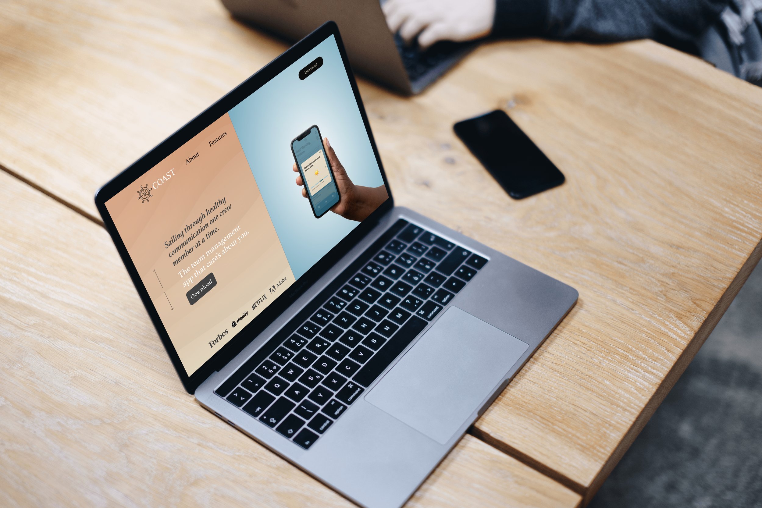
Designing the marketing side of the app I made a responsive website that highlights the tone of the app. I focused on the sharing some research of the problem space and how Coast is making a difference in that space. I then added creditable companies I think the app would do well working with and added key reviews and ratings to boost increase the apps trustworthiness.
Web Application
In testing. I could see the app most used into a desktop setting. Here you will be able to have the same functions of the mobile app setting. I can see this being used more in an office setting. Having a desktop version would scale to the same size of the desktop screen. In the desktop application there would probably be less drop downs and see all the information right away.
Next Steps
01. I would love to work on the other half of the app. What the employers see when employees share their mood status.
02. I’d like to add a resource page for people to look up ways to relax during the work day.
03. Would love to test this in a company and see if people struggling with work stress has decrease in stress.
Key Learnings
This project taught me to design for the needs of other people. Not with what I think would be a way to solve what people are going through but, coming up with a solution that is based off of research and that meets the needs of the user.
I didn’t think doing a More A than B Process would be so beneficial on helping me find the tone and mood of the app. I also didn’t know what my app was going to be until I started finding out the key epic from the user stories. It helped shaped my ideation process and gave me a theme to work with when sketching.
In the process of putting this project together, it opened my eyes as a creative. UX design can be used in so many ways not just in building an app. The structure that’s used for narrowing down your scope and finding the root of problems fascinates me. I can see how these design processes can apply in other forms of creativity as well. For making a storyboard in videography. The sketching process in UX Design can help with that. Or the research of putting together a mood board and giving annotations about your inspiration can help you plan for a photo shoot.
Lastly, with this project I learned the importance of communication with my boss/employer. It’s important to reach out to your boss about your mental load and setting realistic goals for projects.


